Company
Appian
Role
UX/UI Designer
Year
2024
Tools
Figma, Sketch, Illustrator
Languages
Appian SAIL
Overview
As the lead UX designer for Appian's Data Fabric Insights, I directed the design of the report builder and dashboard builder, creating intuitive, no-code reporting solutions. Working closely with another UX designer focused on the data catalog, our goal was to democratize data access and analysis, enabling users to generate insights without developer support. This empowered faster, smarter decision-making across the organization.
The Challenge
Appian users faced a significant obstacle in generating analytics reports because the existing process required developer intervention, making it slow and costly. While the market already offered business intelligence solutions like Tableau, our goal was not to replicate these tools.
We wanted to create a unique, seamless experience within Appian that allowed users to explore data and generate reports effortlessly. The core challenge was to design a no-code reporting solution that delivered speed, accessibility, and confidence in data-driven decision-making.
Showcasing parts of the exploration / ideation phases of the project
My Role
I led the UX design effort, guiding ideation, wireframing, and prototyping for both the report and dashboard builders. Collaborating closely with a UX colleague on the data catalog, I ensured a cohesive and integrated user experience. My responsibilities included:
- Conducting user research and gathering requirements to identify pain points
- Designing wireframes and interactive prototypes for rapid feedback
- Iterating solutions based on usability testing and stakeholder input
- Embedding accessibility, usability, and AI-assisted insights into the design
Outcomes & Impact
"Data Fabric Insights" quickly became Appian’s fastest-adopted feature, transforming how users interacted with data. The results included:
- Reports that previously took minutes or hours could now be generated in seconds
- Business users were empowered to make real-time, data-driven decisions
- AI-assisted insights were available while sensitive information remained protected
- Data exploration became faster and more efficient, optimizing business processes
Reflection
The success of "Data Fabric Insights" reinforced the transformative power of user-centric design. By prioritizing simplicity, accessibility, and empowerment, we addressed a major user pain point and created a solution that exceeded traditional reporting tools. This project highlighted the value of iterative design and close collaboration with stakeholders to solve complex challenges effectively.
The final design delivered a self-service analytics platform that is intuitive, efficient, and secure. Users can explore datasets, generate AI-assisted insights, and create reports with minimal effort.
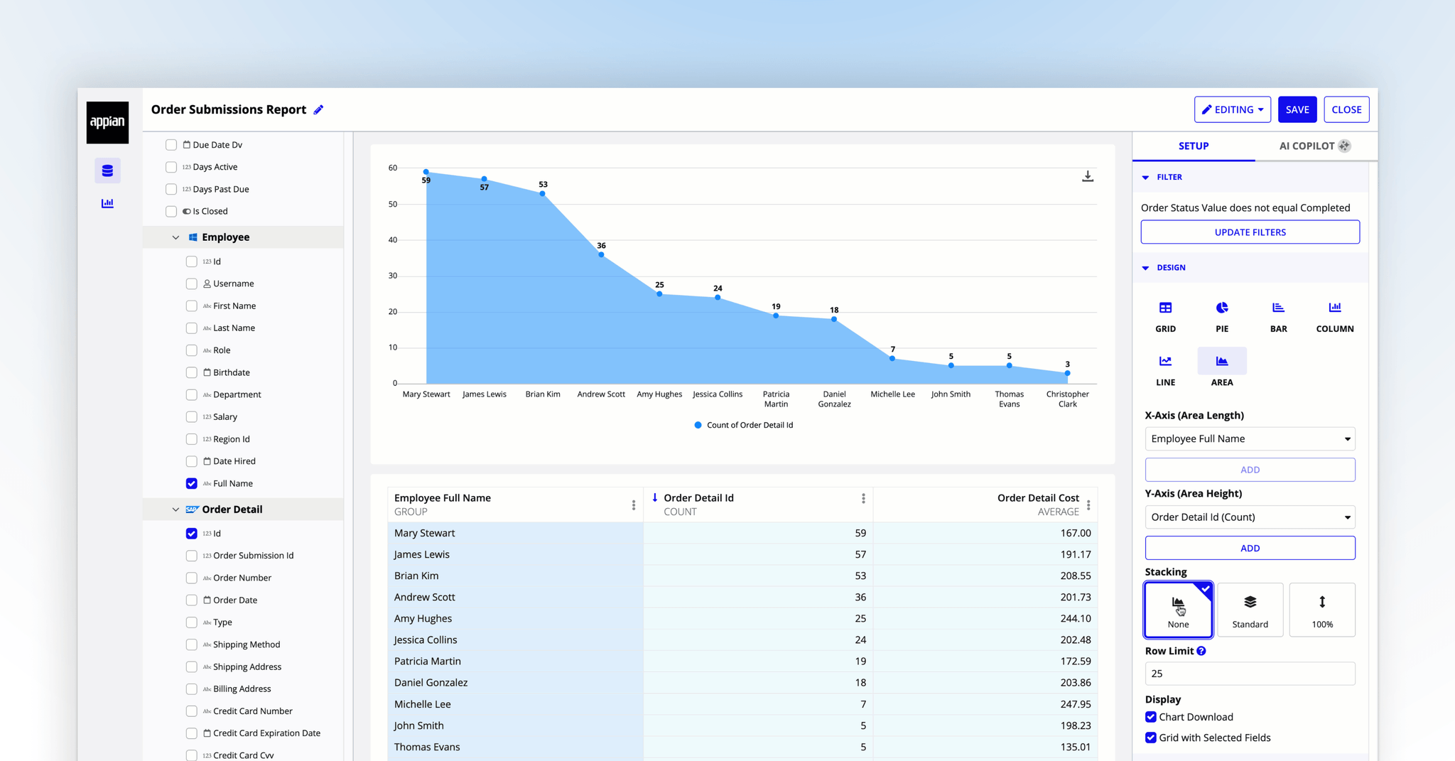
Final Design
Screenshot of the entire visualization huilder
Additional image of the visualization huilder with pie chart