Problem
There was never a problem to be solved when the idea of 70 shapes came to mind. Rather than a problem, I had three specific personal goals.
- Release a product on a world-wide platform.
- Challenge myself.
- Do something fun!
The Team
My team consisted of only my brother Dj (Donald) and I. After running our own small business, Small Squared Designs, we temporarily split ways as we both completed our degrees and went to pursue corporate career paths.

Donald Small
Lead Developer

Branson Small
Lead Designer
Dj has been coding since the early years of high school. After obtaining his degree in Computer Science from the Pennsylvania State University, he went to pursue a career in development at IBM. Since then, Dj has and I have worked on several small personal projects. Dj is currently employed by Salesforce in Raleigh, NC.
I began actively designing a year or so after Dj began coding. I realized the potential of good user experience, and set out to add a bit of flare to his development projects. After obtaining my degree in Information Sciences and Technology and Business from the Pennsylvania State University, I went to pursue a career in technical consulting at IBM.
As both Dj and I have a love for problem solving, simplifying task, and fun projects, we consistently try to and find thing to reinvent the wheel. This time, however, was one of my brain childs.
My Role
As the sole designer on the team, I conducted basic user research, designed all low and high fidelity work, designed/coded the landing page for our app, and created all graphic media for the project.
Research
This project was honestly just for fun. I never intended for a lot of research to go into the project. I knew I wanted to create a game, and I knew I wanted it to be accessible worldwide across all demographics.
Logo Design
While against common practice, I have decided to use the apps name for the logo. In ordinary scenarios, I would strongly suggest against this. Even Apples Human Interface Guidelines (HIG) states the following:
“Don’t include nonessential words that repeat the name or tell people what to do with your app, like "Watch" or "Play." If your design includes any text, emphasize words that relate to the actual content your app offers.”
Since the game has well over 70 shapes and the entire concept behind the game is creating a streak that lasts until 70, I thought there was no better option than to include 70 as part of the logo. Have any better idea? Please let me know!

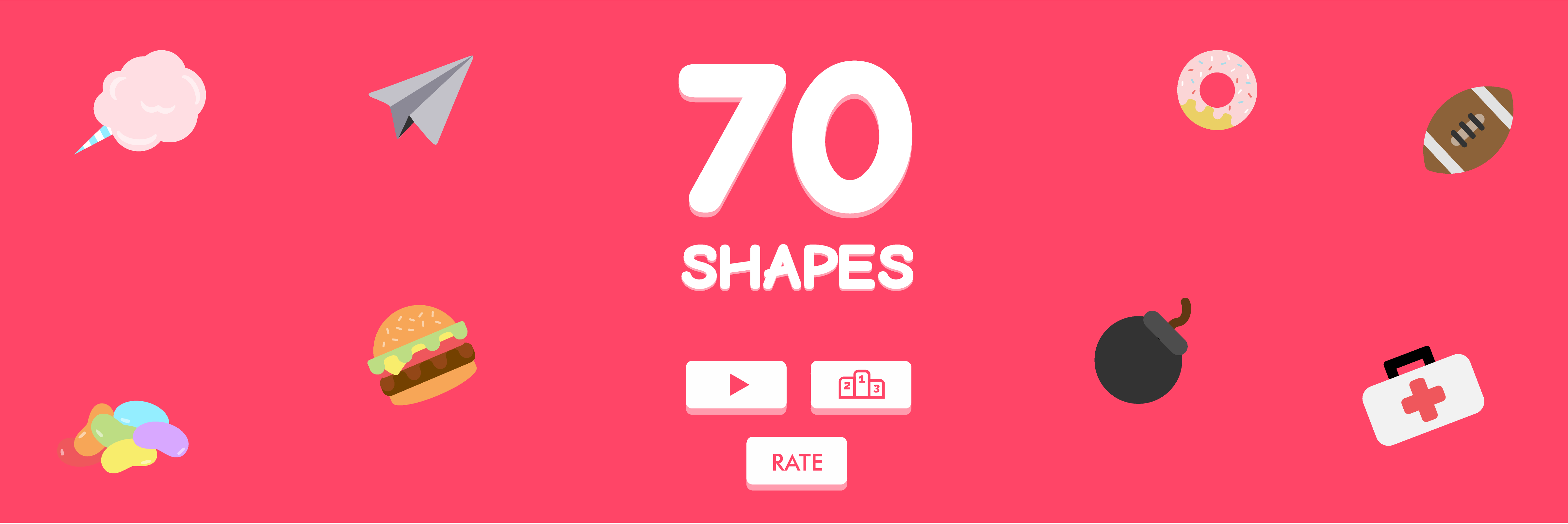
The logo was designed using a free font called Bubblewump. To create the logo, the 70 Shapes name is typed, stylized to the Bubblewump font, given a small drop shadow, and is placed on a bright pink background.
High Fidelity
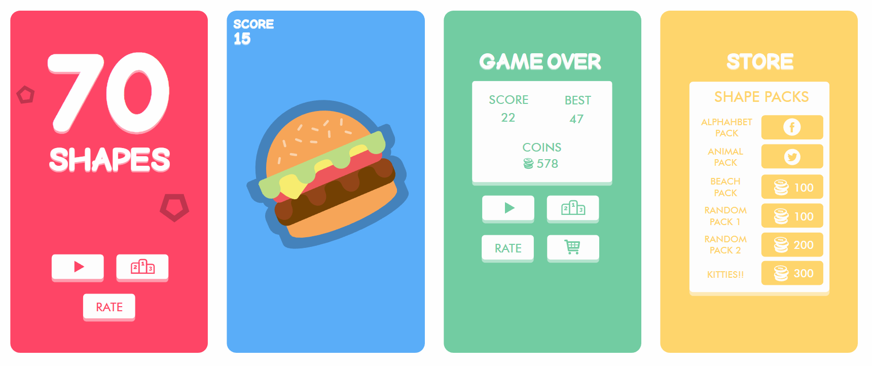
Unlike many of my other design projects, I don’t plan on revealing too much about the game until we’re a few days from launch. We anticipate the game to launch within the next upcoming months. To get idea of how the final product will look, please check out the limited screenshots I have below.
Conclusion
I've been learning a lot throughout this project and I hope you can see how much passion and creativity I can have when I truly believe in something. The project wraps together everything I've learned about design and marketing and the growth opportunities associated to this project are limitless. Wherever my next occupation takes me, I hope it can be as challenging and rewarding as launching this first game. For more information about 70 Shapes, please visit our site at www.70shapes.com
Additional Case Studies
Studyware
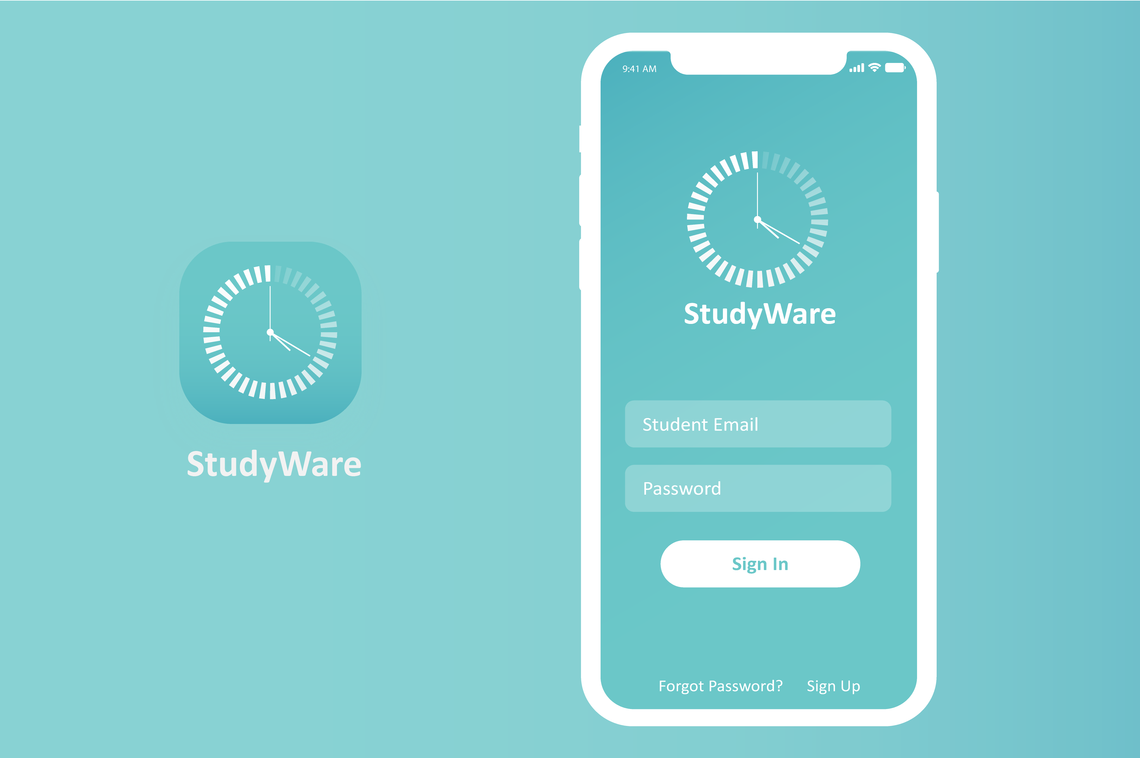
Bridging the gap between education and technology. StudyWare offers a creative solution to hard working students within the classroom.
Snap Antiques
Ever wonder how antiques get priced? Short answer - handwritten labels. I believe it’s time for a fix… Snap Antiques - the new POS for the antiquing industry.
