Overview
For the past several years, my mom and I have continuously rated movies. We’d hop on Netflix, pick one of the ‘Popular on Netflix’ films, and begin watching. Afterwards, we’d rate the film giving it a category from A to F.
This was fun! It was something we could do together. Something simple, no strings attached as they say. The more and more we watched, the more and more critical our ratings became. Then the worst happened, we couldn’t remember which films we watched. Something had to change - and fast!
My Role
As with many of my personal projects, I worked as the sole designer on the team. I took the idea to my brother and he agreed to help me with the Node.JS and React development work. As the designer, I designed the low fidelities, created the mySQL Database, and stylized the CSS for the responsive web components.

Donald Small
Lead Developer

Branson Small
Lead Designer
Research
We knew we wanted to review films, but what was the best way or doing it? How do other companies such as IMDB or RottenTomatoes rate their movies? With these questions in mind, I set out to find some answers.
Believe it or not, most of the content from IMDB and RottenTomatoes comes from their users. Besides some basic information which can be gathered by the movie companies, descriptions, actors, and categories are defined by everyday users like us. While discovering this information, it made me think about the rating system in general. Sure movies on these sites might be 95% or 64% but how do they get that specific percentage?
While looking at several additional sites, I realized most movie review websites have no specific criteria. According to the following article by TheWired, “
“All registered IMDb users can submit a single rating – a number between one and ten – for any film on the website. These votes are then re-jigged so that certain demographics (newly-registered users, for example) don’t disproportionately influence the overall ranking of the film."
The image below shows this distribution on IMDBs website:
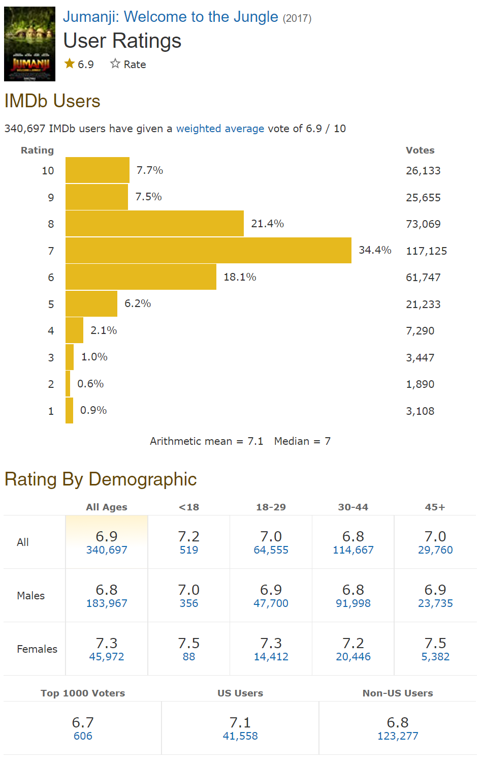
This left me feeling pretty unsettled. Sure this rating system might provide an average rating, however, each rating was never based on any specific model. One person might rate a film a ten based on their favorite actor but others could rate a film as a two based on cinematography.
I knew I wanted to provide a visualization as to how my mom and I would be rating movies. As a team, we agreed the films should be based off of the following ratings. Each category would be rated out of five and the average sum of the rating would equal the films percentage:
- Cinematography
- Storyline
- Soundtrack
- Visual Effects
- Acting
Low Fidelity
Whenever I get an idea I’d like to pursue, I can’t sleep unless I’m able to write something down or create a quick sketch. After I committed to the idea of a movie review website, I immediately went to Adobe XD to begin mocking up a simple low fidelity prototype. Whenever I begin a project, I like to use a component library I’ve created in the past to quickly drag and drop items to get an initial feel of how the site might look.
The fidelity was broken down into three specific artboards. The first artboard contained components I intended to reuse in the design multiple times. The second and third arboards was a combination of the components organized and styles to create the basic structure of the site.
After two to three hours of working, I finally had something to put my mind to rest. I went to bed eager to start working on the project the next morning. A low fidelity mockup can be found by using the following Adobe XD link:
https://xd.adobe.com/view/7135502c-18a6-4eac-832c-68c315ae07cc-2466/
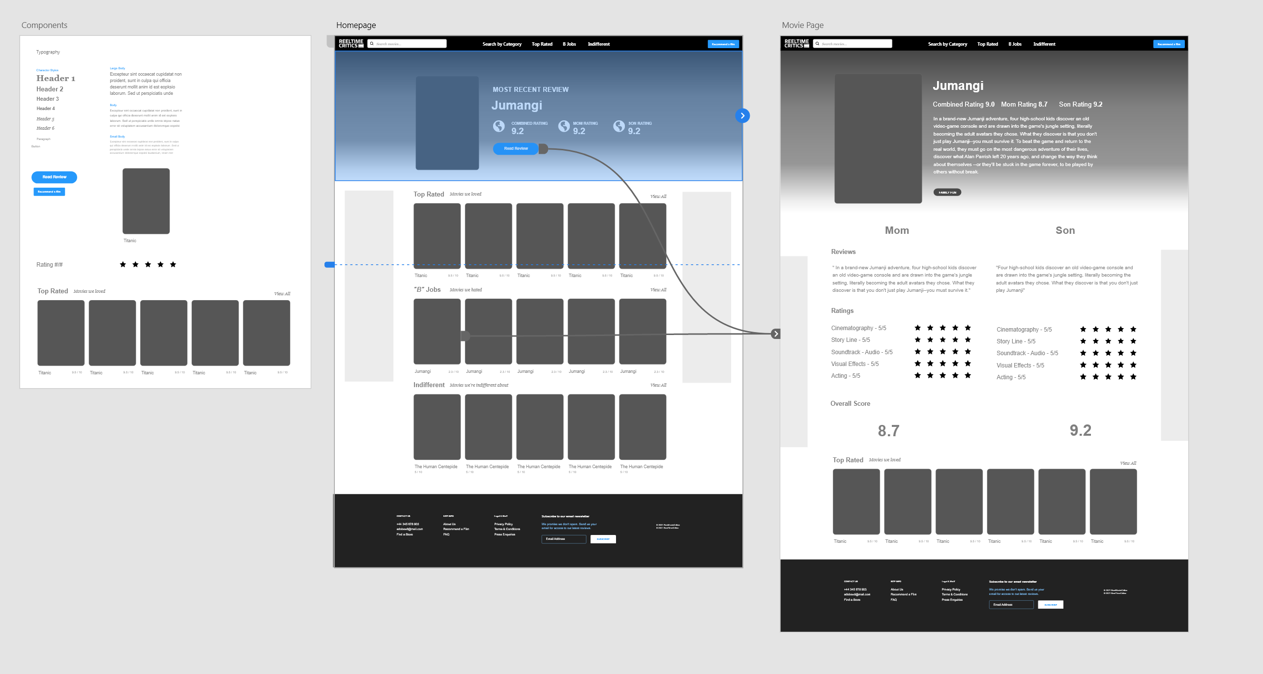
Screenshot of AdobeXD
Logo Design
The logo design process for ReelTimeCritics was quite simple. The logo didn’t need to be a world class logo but it did need to be something to differentiate itself from the other existing movie websites, including rotten tomatoes and imdb. All in all, after talking to my mother, we decided that the logo should convey three main themes/topics: Movies, Simplicity, and Balance.
Using Adobe Fonts, I went in search of a typeface which had a high x-height, was san-serif, and had medium to high contrast. After playing around with the filters I finally settled on “Quatro”.
After selecting the font, I opened Adobe Illustrator and went through several iterations of how I wanted the logo to look. I stacked the words “ReelTimeCritics” and began trying to create a logo which was simple but yet reinforced the idea of film. My mom and I discussed many options but eventually settled on a combination mark. We’d simply display the words “ReelTimeCritics” but also include an icon to create contrast. The color used would also serve as the primary color of the site. To create a sense of balance, we chose an aquamarine dark green color. I placed the color within a simple rounded hexagon and put two images of movie reel snippets. I merged/simplified my layers to ensure exporting as a png or svg would allow a header color to show through the green hexagon. An overview of the illustration process can be found below:

Logo design process
High Fidelity
Unlike many professional projects I’ve worked on in the past, I didn’t need to convey the finalized site to shareholders or clients. As such, I never had the need to create a high fidelity prototype. I knew my brother was going to be helping me develop the site, but all he needed was a low fidelity to create the shell for each responsive web component which would eventually be created. Each component would use the react framework and would use Node.JS to grab the data from the database.
After presenting him with the low fidelity prototype, I began working on creating the table structure to hold content within the site. I created a basic mySQL database and compiled basic data for each column presented within the table.

Picture of mySQL Database
After the web components were created and basic data was linked to the site, we finally had a rough minimum viable product. Everything still needed to be stylized and that’s where my next piece of work came in. Over the next several hours, I spent time creating and modifying the CSS linked to the responsive web components. Below is a screenshot before refining any of the CSS on the site.
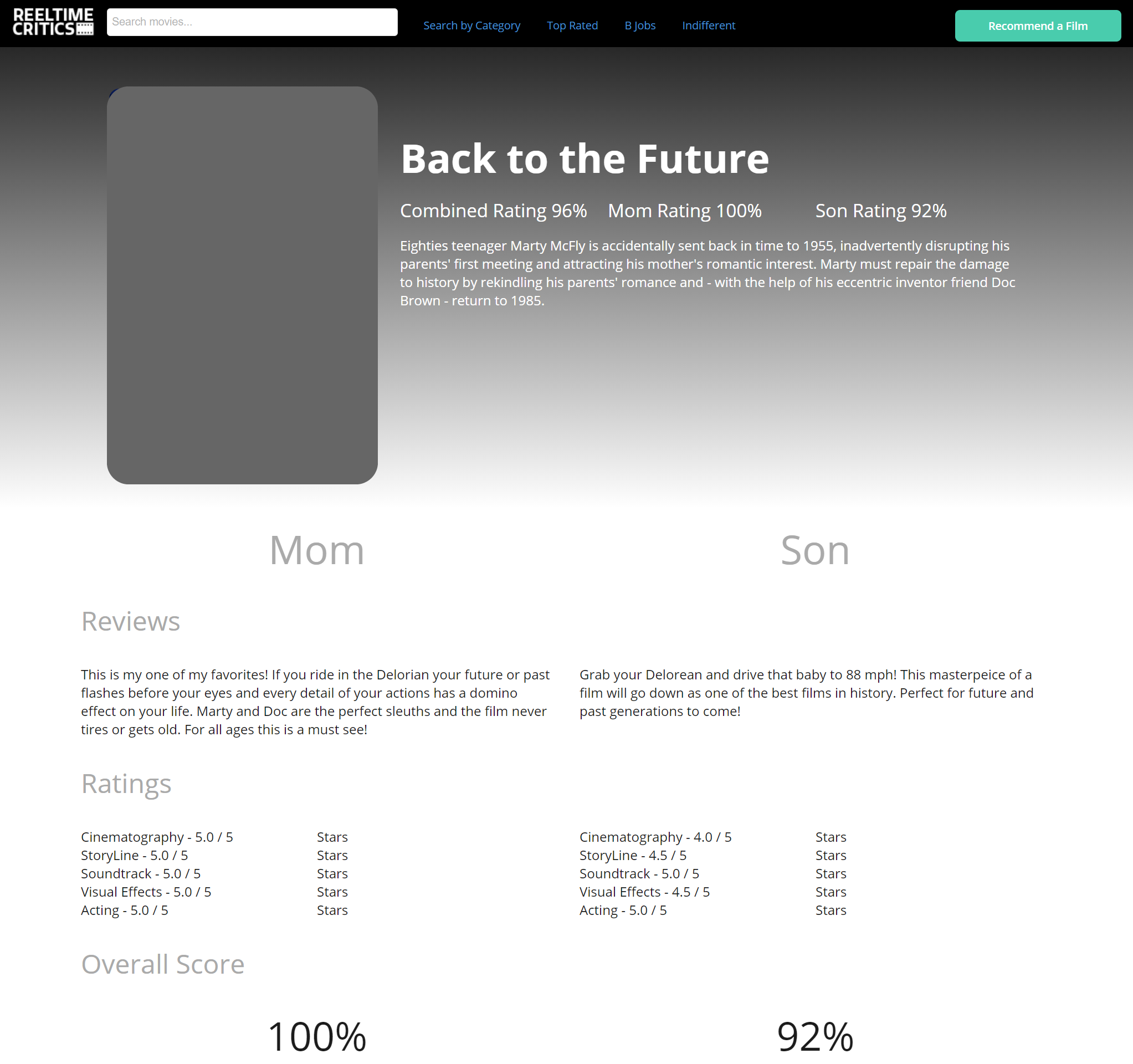
MVP linked to mqSQL Database
Conclusion
I had a great time designing this site. In total, the process only took a weekend to design and develop! While there’s a lot more to do to the site, and a lot more films to watch and add, I’m extremely happy with the final result and can’t wait to expand the site in the future. Throughout the experience, I learned many things including time management and organization. Most importantly, my three main takeaways were:
- It's best to have a team with mixed skills. I eventually would have been able to design the site but having a partner support development was crucial to the weekend development timeframe.
- Always seek innovative solutions to your problems. Gathering basic movie information for the site would have been alright but using a movie API is a way better approach.
- Adobe XD is my favorite wireframing tool! In XD, not only can you share your resources directly with other users via a web interface, you can export basic CSS for items which you might include in your component library.
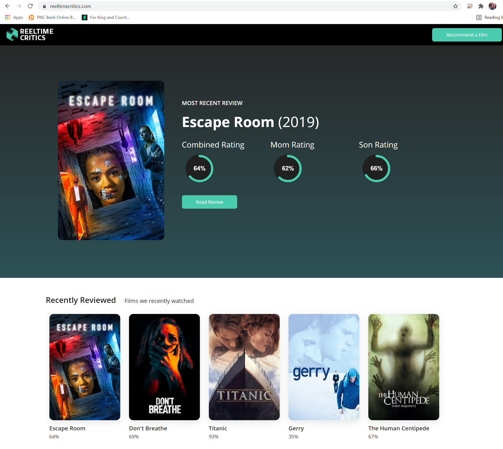
Screenshot from Site
Additional Case Studies

Snap Antiques
Ever wonder how antiques get priced? Short answer - handwritten labels. I believe it’s time for a fix… Snap Antiques - the new POS for the antiquing industry.

70 Shapes
One shape, two shape, three shape, four. Click and hold until it's the perfect size. Accidently miss the shape, start back at #1. Can you make it to 70 shapes? Soon to be available for iPad®, iPhone®, Windows Phone®, and Android®
